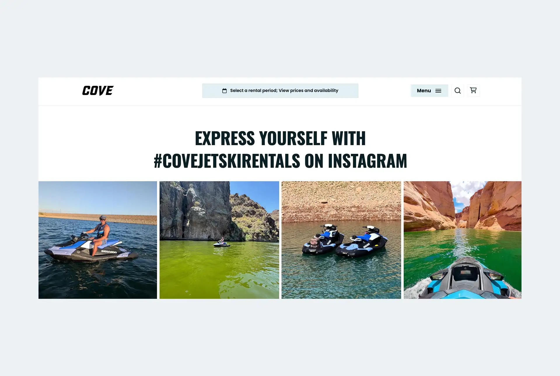
The booking experience can make or break a rental business as it’s usually the only way a customer can place an order online. If it’s clunky or unintuitive, it can turn customers off and lead them to a competitor who has a more professional booking process. In addition, it could stop them from recommending your rental business to others.
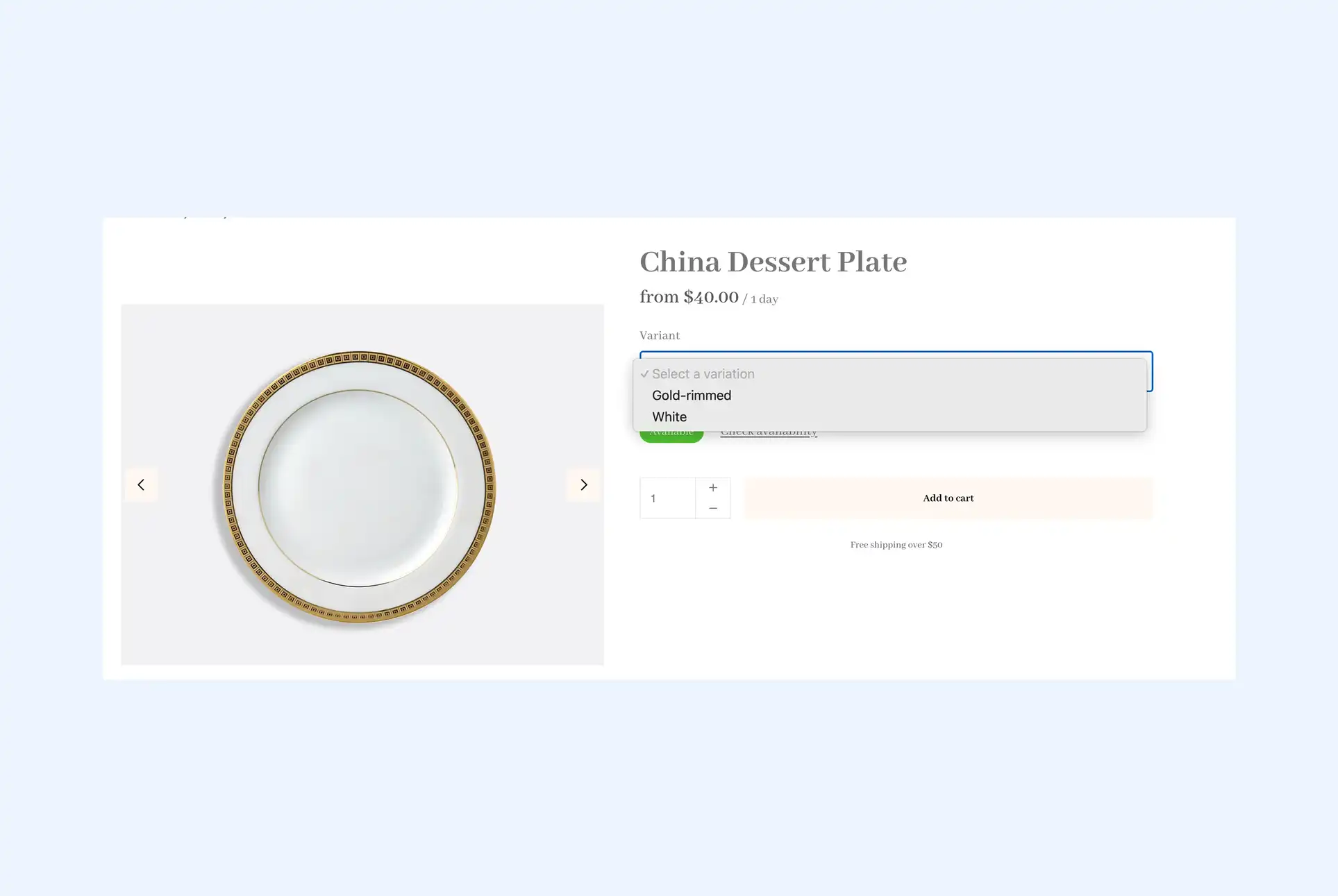
A few things contribute to the most ideal booking experience for rental businesses. Firstly, it needs to be easy and intuitive to use with elements like a date picker that makes and doesn’t overwhelm the customer. There should also be attractive images and descriptions to get customers excited. In addition, features like live availability can help reduce hesitation from customers who want to be sure the products they want are available.
That’s why it’s so important to get it right the first time and create a fantastic booking page. Booqable can help you do this with embeddable components that can be added to your website to help you create an excellent experience for your customers. So, let’s look at some of the best booking pages people like you have made.
1. Campers and Kit
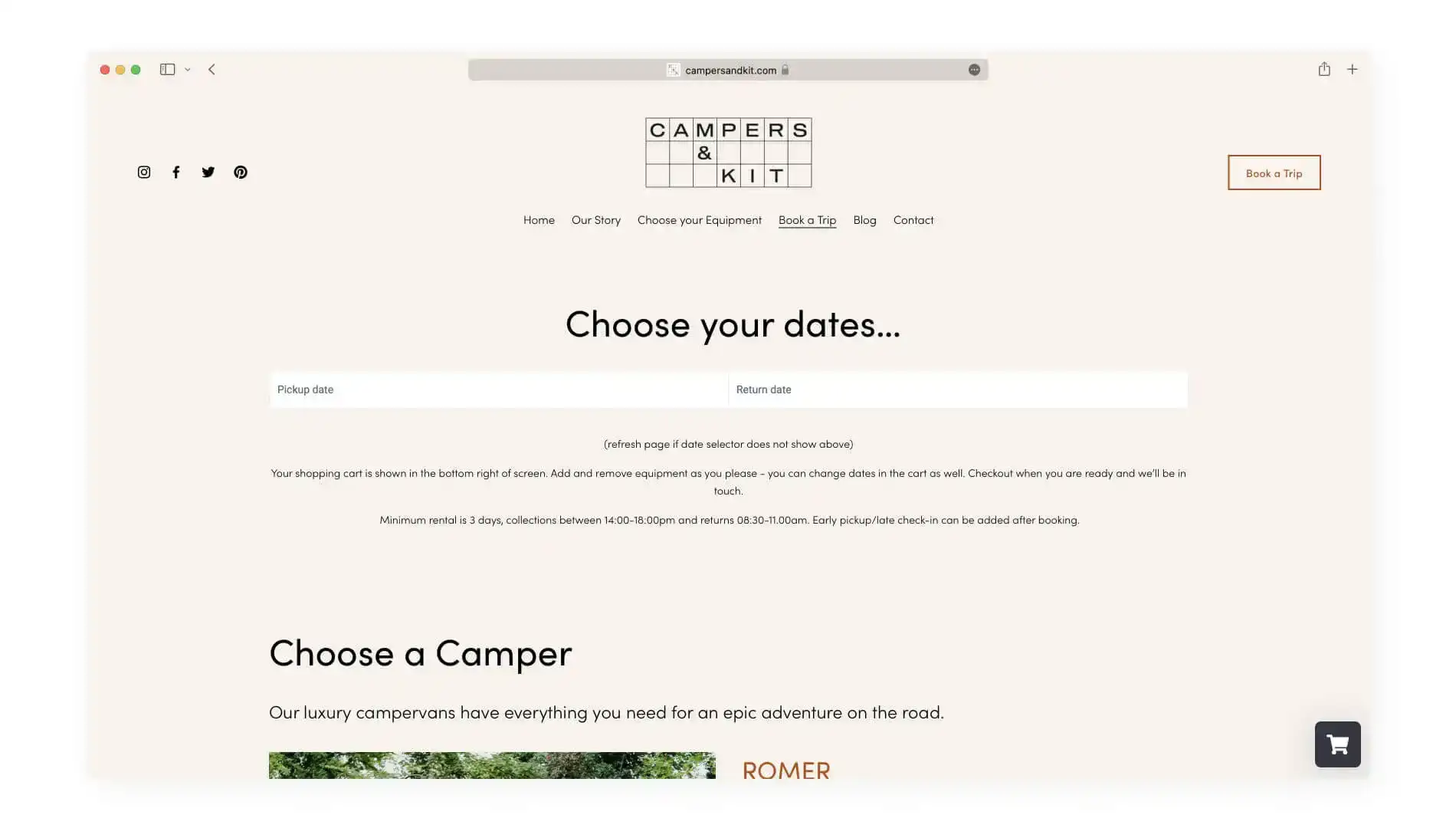
Campers and Kit call themselves an adventure rental business, and this experience starts with their page title. Rather than simply calling it “Book a Camper,” they call it “Book a Trip.” This immediately brings to mind an adventure and gets you excited to make your booking.
Once on the page, you choose your date, pick a camper for your “epic adventure,” and add one of their curated adventure kits to enjoy on your trip. These include mountain bikes, kayaks, surfboards, and hiking equipment, and by the end, you’ve planned the perfect weekend getaway.
2. Cycle Sierra Nevada
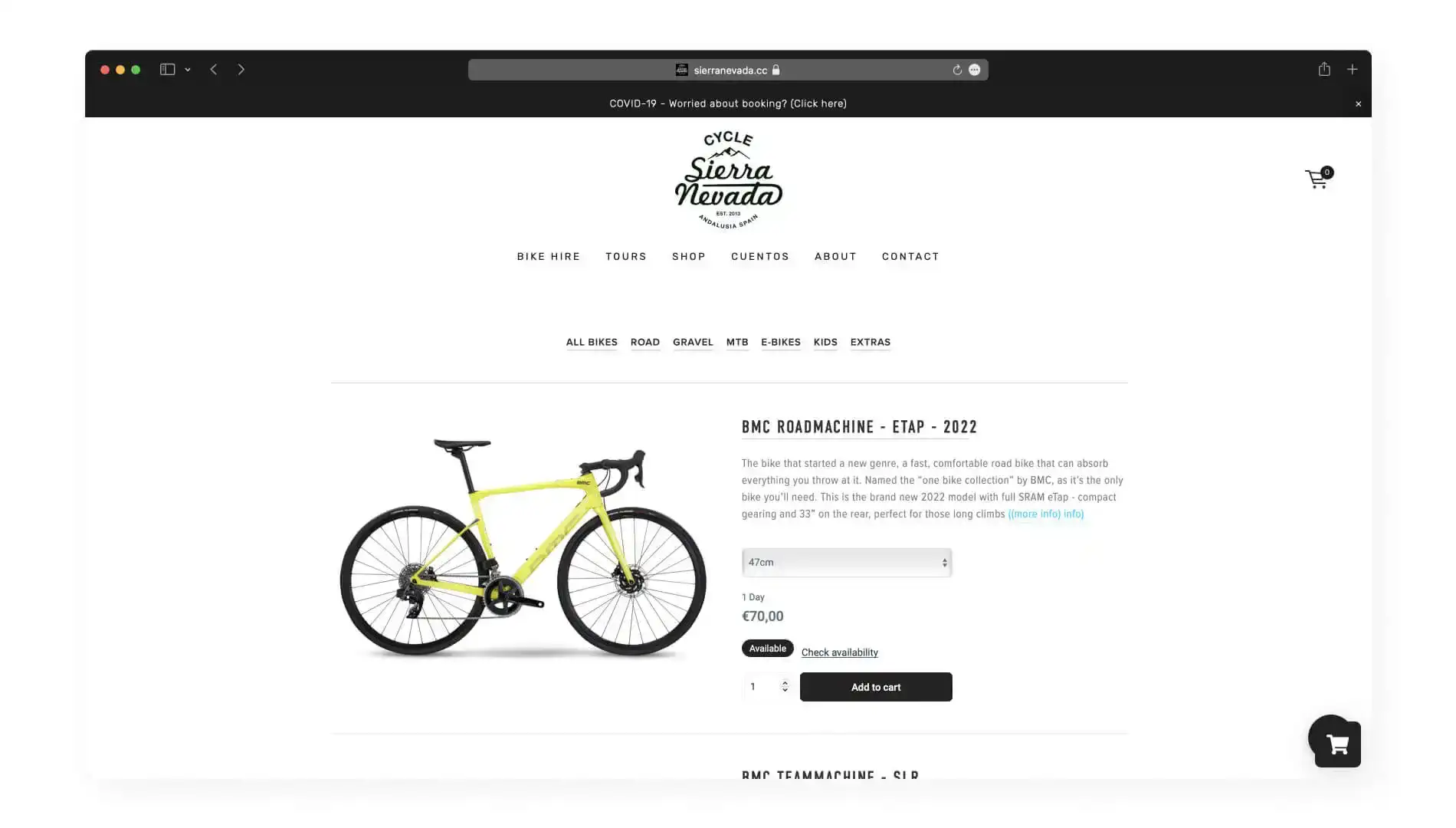
Cycle Sierra Nevada is based in one of the most beautiful cycling locations in Spain, and they aim to provide a premium biking experience. This starts with their booking page, where you are greeted with a brief description of how it works.
Then, you are encouraged to enter your rental period before going to the next step. Once you have chosen your date, you can choose what kind of bike you want to rent from the categories at the top of the page. In addition, each cycle is accompanied by an excellent description.
3. Sharegear
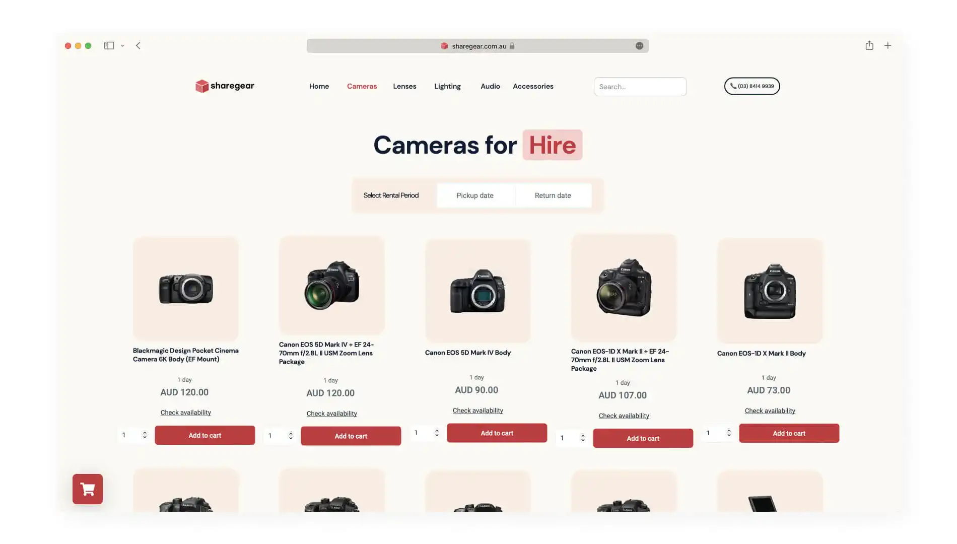
Sharegear is an Australian-based camera rental business that aims to make renting cameras easier for everyone. They have a contemporary feeling website that reassures you that they know what they’re talking about and breaks down the booking process into simple categories.
You are greeted with a minimal booking screen once you’re on the camera, lens, lighting, audio, or accessories page. You select the date and the product and move on to the next category. In addition, you can open a product page for each item that will give you an in-depth description and product review.
4. Cloth and Confetti
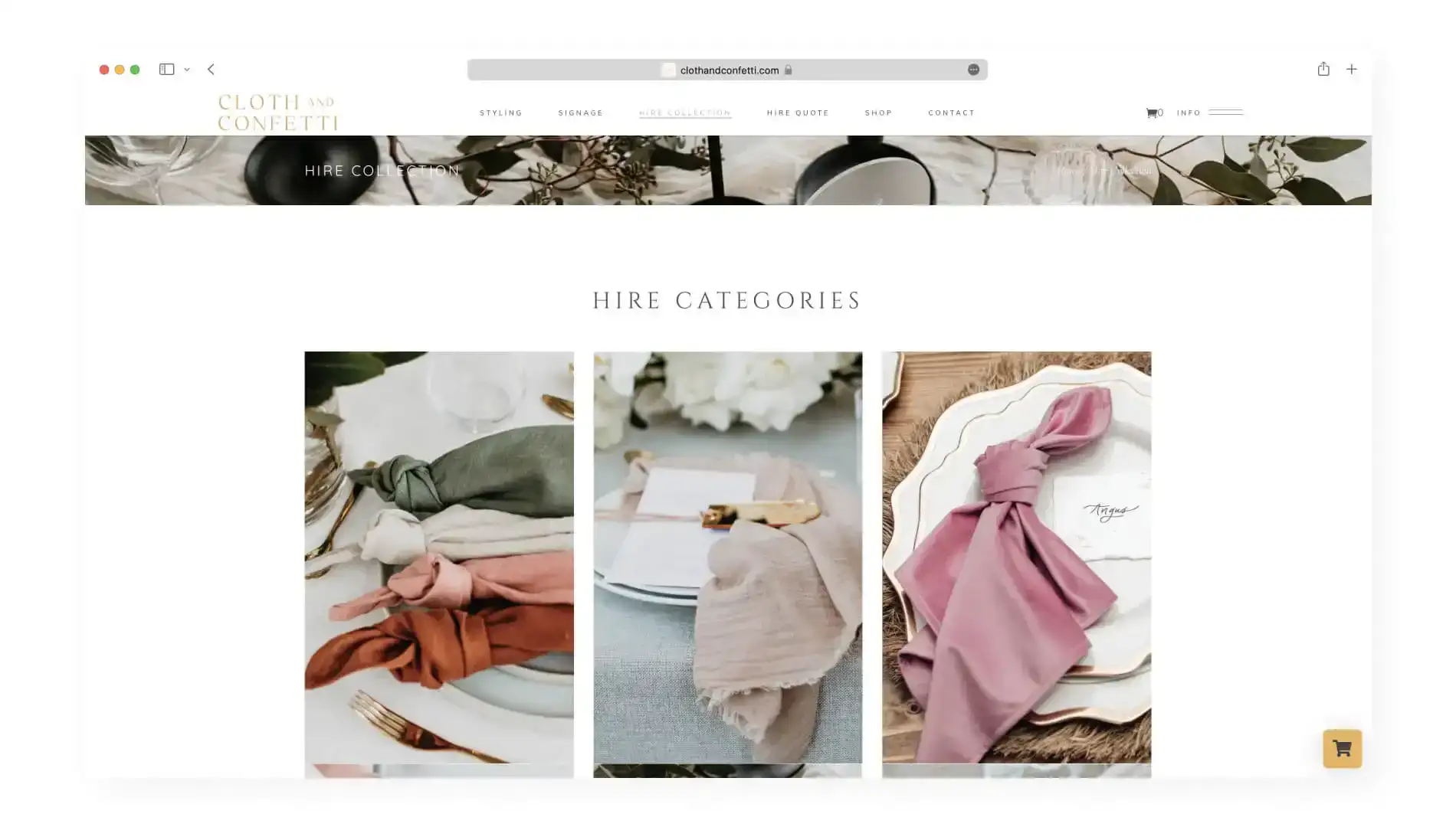
Cloth and Confetti is a Melbourne-based event rental business specializing in catering to weddings. Their website is elegant and befitting what you would expect when renting equipment for your wedding. It feels like you’re browsing a beautiful wedding magazine.
As a result, it is less streamlined than previous examples and is designed for couples to go through like a catalog. Their “Hire Collection” is broken down into categories that make them easy to browse and are accompanied by beautiful imagery. This helps create a booking system that matches working with a wedding planner.
5. Mike’s E-Bikes
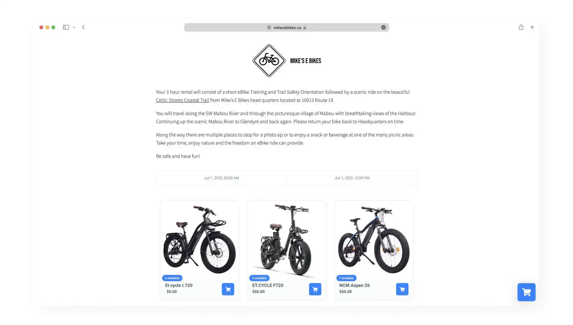
Mike’s E-Bikes is based in Nova Scotia and offers e-bikes for use along the famed Celtic Shores Coastal Trail. Their website is among the most simple of the examples we’re sharing today, featuring one landing page that swiftly tells you about the experience and allows you to pick a date and book your bike rental.
This one-page style for everything allows the booking process to be straightforward and with no fuss. The excellent description of what you’re getting and what you can do in the area is enough to entice you to make a booking. Then, the simplicity of picking a date, time slot, and bike you would like to rent makes the whole process super easy.
6. Alkmaar Boat Rental
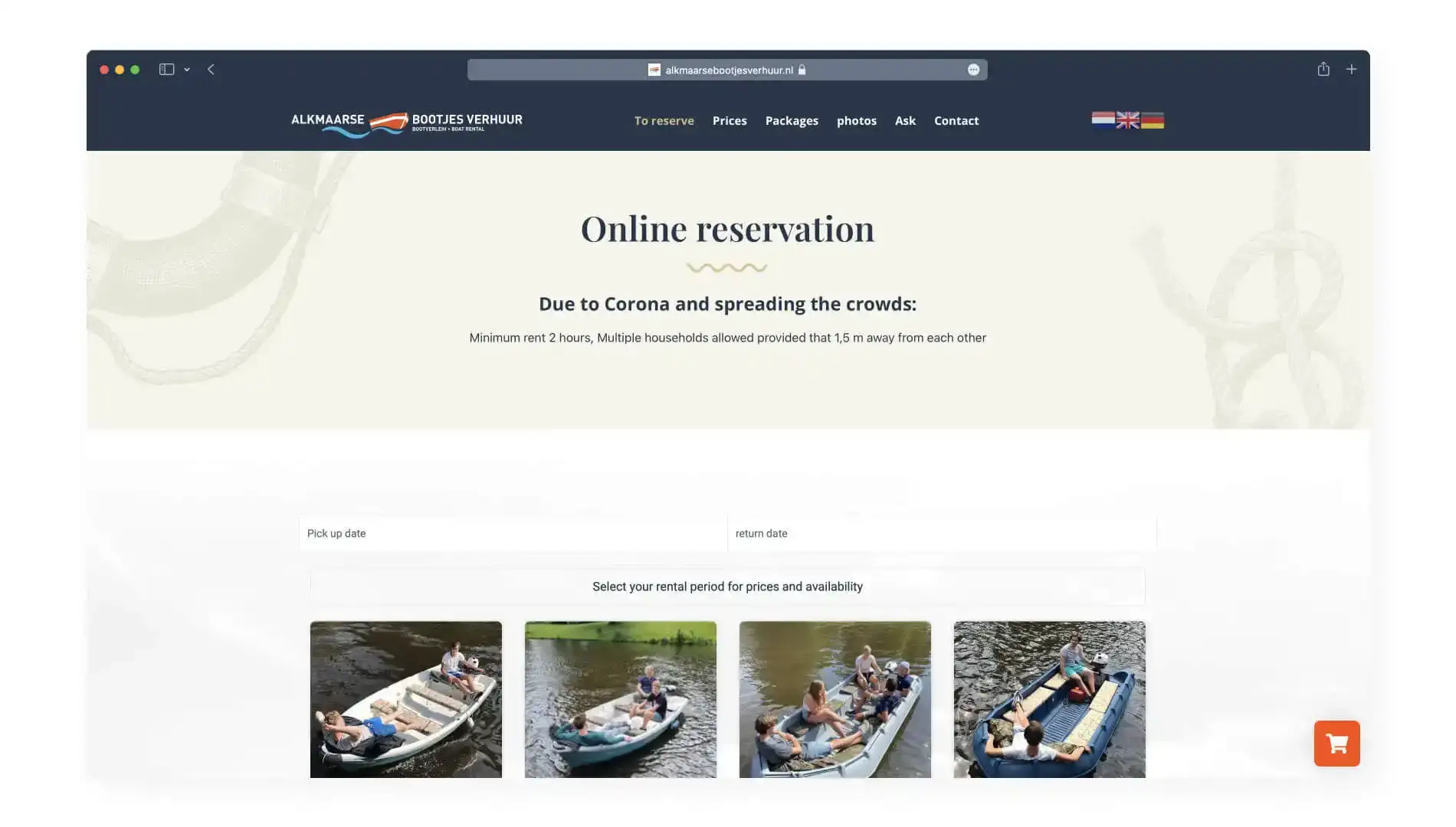
Alkmaar Boat Rental offers the traditional Dutch experience of exploring the beautiful city by boat. You are greeted with a stunning video that shows you exactly what to expect, while the website has a nautical theme. You can choose to book a boat or a package.
On the booking page, you are met with a selection of boats in various sizes showcasing people relaxing and enjoying them. Selecting your rental period and the boat you would like to rent is easy. In addition, the guide to how many people can fit in each boat helps the decision-making process.
7. Åre Bikes
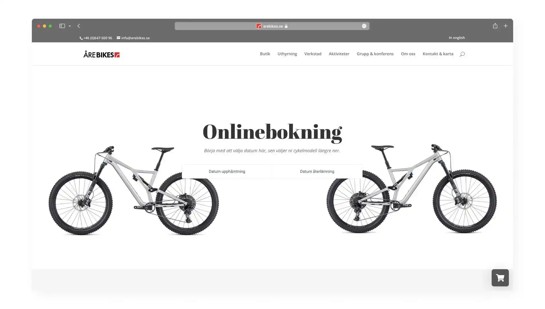
Åre Bikes is a Swedish bike rental business that does things differently from your average bike store. Some bike rental websites can feel cluttered; theirs is more minimal and sophisticated. It feels like a more premium bike rental experience than most, and their booking page is no different.
First, you choose your rental period, then scroll down the selection of bikes they offer. These bikes are broken down into categories that make them easy to browse and fit exactly what you’re looking for. In addition, you can also rent equipment for carrying your bike on the back of your car.
8. Neon Hire Australia
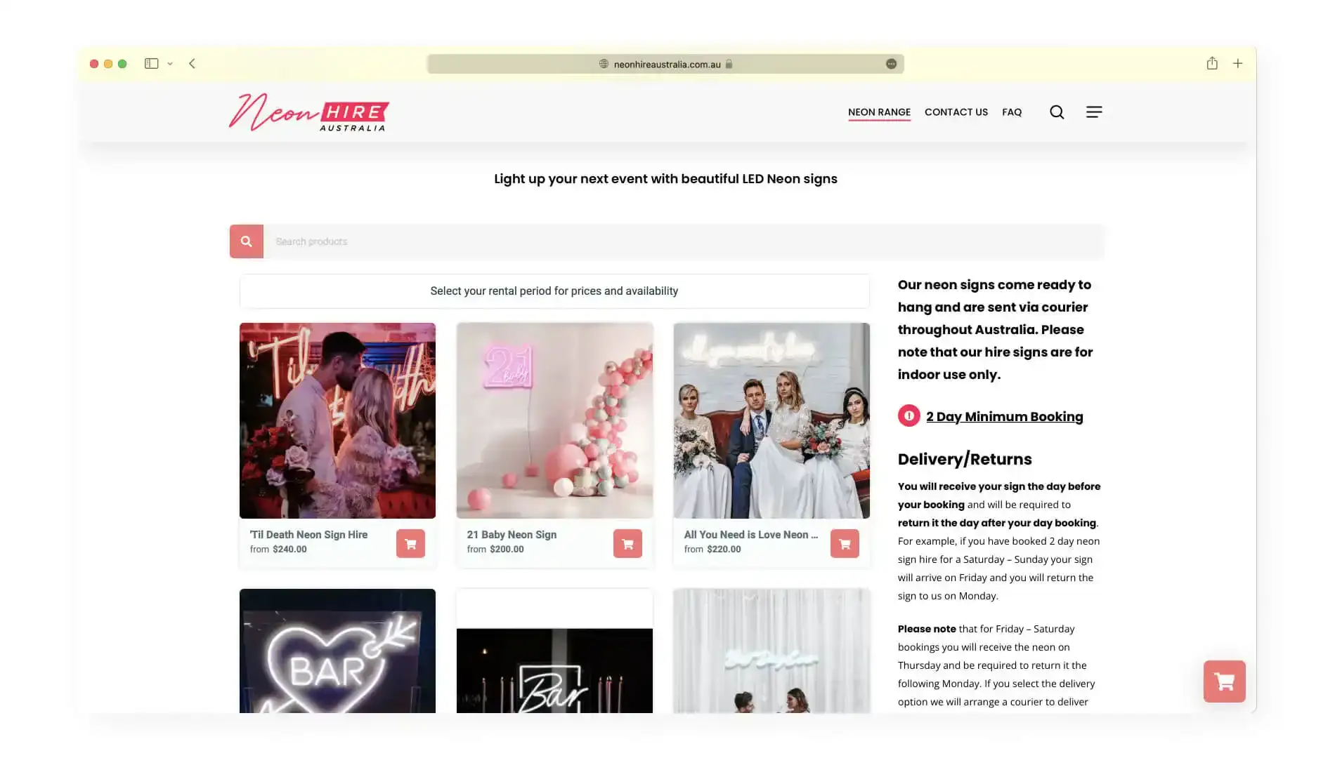
Neon Hire Australia rent out neon signs in, you guessed it, Australia. When you visit their website, you are greeted with colors and imagery that scream “perfect for the gram.” This is, after all, what you’re looking for when you want to get neon signs for an event, in addition to creating a significant impact.
Their booking experience feels like you’re scrolling through Instagram to find the perfect mood for your event. Each sign is expertly modeled in the context they are designed for and gives you a feeling of what you can expect from renting each one. The booking process is simple, choose a date and a sign, and you’re ready to go.

